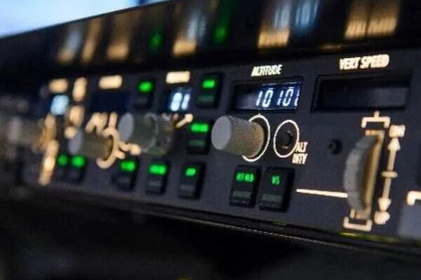
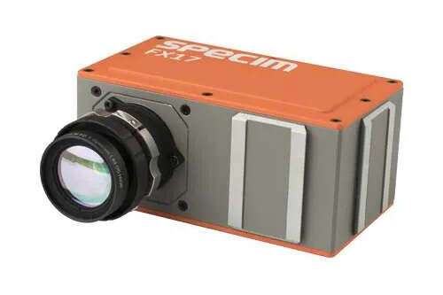
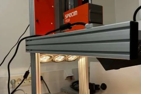
Pink is for Boys, Blue is for Girls


How Brand and Product Colors May Influence Consumer Purchasing Habits

According to some sources, it may have been common for boys to be dressed in pink and girls to be dressed in blue in the early 1900s. Earnshaw’s Infants’ Department publication in 1918 wrote, “The reason is that pink, being a more decided and stronger color, is more suitable for the boy, while blue, which is more delicate and dainty, is prettier for the girl.” In current times, blue is more often associated as a color for boys and pink is more often associated as a color for girls in the United States. This shifting viewpoint illustrates how purchasing behavior can be influenced by our perception of color.

Personal experience and preferences help form our perception of each color, making it a particularly important element for brands and products. Our brains often recognize a brand or product and make conclusions about its personality based on color. One study, called the Impact of Color in Marketing, found that up to 90% of judgments made about products can be determined by color alone, while another study found that color can increase brand recognition by up to 80%. If the color of a brand or product is inappropriate or does not fit the brand or product’s personality, sales could be significantly impacted. After all, how many parents of rough, masculine boys would identify with a brand or purchase items with color perceived as delicate and dainty?

When selecting the right color for a brand or product, it is important to consider:

  • Recognition: Which colors best represent and differentiate the brand or product from competitors? Will the selected colors be recognizable to prospective and current customers?
  • Audience: Who is the target audience? How are the chosen colors perceived by each audience type, including gender and culture?
  • Environment: Where is the product being sold or brand image being seen? What type of lighting conditions do these environments typically have?

Companies in the food industry, for example, may choose a red hue in their logo, product, or design. When seen, this color is said to evoke excitement and trigger hunger. On the other hand, delivery companies may choose a dull brown hue in their logo or design because this earthy color is often associated with being dependable, practical, and reliable.

The problem for many, however, is not choosing the right color, but rather reproducing the same shade in each batch or in different materials. Inconsistencies may cause consumers to perceive the product or brand as low quality.

To specify, formulate, evaluate, and manage your brand and product colors, high precision color measurement instrumentation and color management software are required. These tools not only enable users to evaluate and standardize color, but to accurately communicate, coordinate, and control color throughout the supply chain. With this, you can trust the correct shade of pink, blue, or any other color that best suits your brand or product is continuously produced.

To specify, manage, and control your brand and product color palettes more easily, the following products are recommended:

Colibri Color Management Software (Cloud Platform) >
Specify, formulate, evaluate, and coordinate color from design to manufacturer to finished product

Color Measurement Instrumentation >
Generate precise data to help you perform more effectively

Like this article? Click here to sign up for our monthly Color Trends & Technology newsletter to stay updated on the element of color, best practices for controlling and evaluating the color of objects, educational seminars, and advanced technology for research and manufacturing environments.

The technological leader in color and light measurement solutions, Konica Minolta Sensing Americas helps organizations formulate, evaluate, and control color to meet product quality and operational goals more efficiently.

Privacy Preference Center