The Conflict Between Light and Color
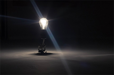
The room doesn’t match the tone you were going for, but what threw off the color? The answer is usually lighting, because a light source has a significant effect on the color we see.
When two colors that are not exactly the same match under one light source, but not others, it’s called illuminant metameric failure. Metamerism, despite sounding like something a wizard would study, is the perception that two colored materials look the same under certain lighting conditions despite reflecting back light at different wavelengths.
This phenomenon took center stage in 2015 when a certain dress ignited an intense debate about objective vs. subjective color. You may encounter metamerism every day and not even realize it.
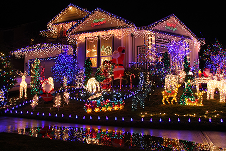
For example, if you’re picking out paint at the hardware store, where there’s colder halogen or fluorescent lighting, you might end up with an unexpected result under the warmer, incandescent light we use in homes.
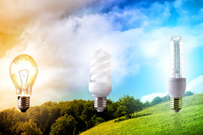
The color temperature of daylight is around 5000-6500 Kelvin, and it’s widely used as the standard in printing shops. But a 100-watt lightbulb will only produce about 2,900K, which could lead to a very different color tone. The type of bulb also factors in, as LEDs have a bluer light to the red of incandescent sources.
To make it easy to remember, if you’re going for blue, go fluorescent; if you’re going for red, go incandescent. It also applies to photography, where warmer light makes us look radiant, while we appear ghostly in blue light.
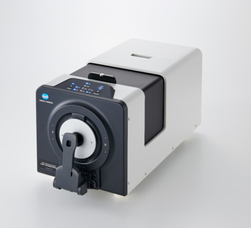
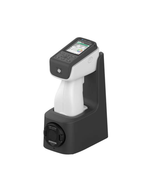
There’s no denying an effective, objective method of measuring color is important, and that so many things can go wrong when you try to “eyeball it.” Using spectrophotometers like the CM-5 or CM-17d, manufacturers analyze the color of products like paint or ink and assign it a numerical value.
This creates a benchmark for repeatable, reliable results, so you’re never left guessing. Using these tools and software like the SpectraMagic™ NX2, creating uniform color standards is easier than ever. And that’s good news in any light.